12 Jan Kamala Harris’ Vogue Cover is Everything I Would Expect
So, I commented in a Facebook group on photography that I really like this photo. I was asked to expand on that because this seemed to be an incredibly controversial statement. The opinion of the photographic and wider community seems to be that this is a terrible photograph and certainly not one that is worthy of either Harris or a Vogue cover. I don’t entirely know why that’s the case. I don’t understand what makes it a good photo. Normally even when I like a piece of art I can understand why others don’t. But here, I’m stumped.
I think it’s interesting that people who don’t like the photo aren’t being asked to expand on that, but there we go. I said I’d have a go at expressing my thoughts this morning, so here they are.
I’ll preface this by saying two things:
1. I am not a particular fan of Harris. While I recognise that she is a historical choice for the role, many of her ideological views do not align with mine. So I’m not writing about liking this portrait purely because I’m a fan of hers.
2. I am currently researching a PhD in art history, and I’m focussing on eighteenth century portraiture. This will undoubtedly inform the way I see the image as I don’t come from a “pure” photography background.
Background choices in portraiture
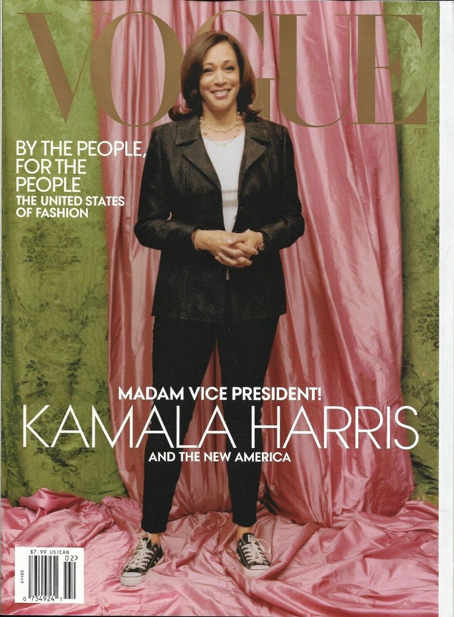
I was interested in the colour choices and the inclusion of draped fabric in the background. I found it interesting because it seems almost a dated choice for the front cover of Vogue magazine. I don’t regularly buy Vogue, but I don’t remember a cover using this kind of draped background for a long time (although of course I may have just not seen it).
To me, the draped fabrics signal a particular heritage. Several centuries ago Joshua Reynolds (and others) preferred painting women dressed in drapery (literally, draped fabrics in a quasi Roman/Green style) because he viewed it as more classic and timeless. Indeed he talked about it in one of his speeches to the Royal Academy. It also recalls the sumptuous, draped fabric backdrops of much historical portraiture, and to me seems a direct reference back to these depictions. The luxury of being able to drape your walls with fine fabrics portrays the subject as a person of wealth, but more important a person who belongs to this world where portraits are made to commemorate special occasions.
The draped silk and brocade backdrop says that Harris is here. She is a member of the social class who are important enough to have grand portraits made of them. She belongs in this institution. This deliberate indication of inclusion is crucially important in her depiction. She has as much authority and right to be in her new job as any man does, and as any white person does.
Full length vs head and shoulders
The full length choice makes sense to me too. I don’t think it’s solely about her fashion choices, or about her standing on sumptuous fabrics in trainers as a signal of rebellion as I’ve seen others say (although I do like that reading). I think that this is another reference back to historical portraiture.Vogue rarely puts a full length portrait on the cover these days. That’s strikingly unusual. But historically, full length portraits were much more expensive than head and shoulders portraits, and were therefore only really commissioned when there was a specific purpose for their existence. While you might commission a head and shoulders portrait of you as a gift for a friend, you would only commission a full length portrait when you had somewhere to display it – these were substantial objects often almost 3m or so in height. They made a particular statement.
Everything about a full length portrait, both photographic and painted, takes more time. It requires more thought. More technical skill. More style. More money. You have to style a person from head to foot. You have to pose them. You need a larger studio, more lights, with bigger backdrops. At an estimation (historical costume making is my hobby), there’s probably two thousand pounds worth of fabric making that backdrop. At least.And then there’s the colours. Apple green and salmon pink. Unusual enough choices (although not particularly shocking) that I looked it up. Her sorority. The first African American sorority to exist. I mean wow. I don’t know much about sororities, but I do know that’s a big deal.
So what?
So here we have a photograph that says she belongs to the upper echelons of society, that cost thousands to stage in backdrop fabric alone, and that references the women who have lifted her up to get her to this place today.
This isn’t a portrait of just Harris. This is a picture that honours the women who have struggled before her, who have not had their day in the spotlight. It tells us that she stands on the shoulders of other women who have blazed trails for her to follow.I mean, just wow. Vogue is telling us that here is a woman who belongs to this part of society who have important, full length portraits made, and they’re also telling us to remember that other women have not had this same opportunity in the past when perhaps they should have done.
Everything about this portrait is bold and revolutionary. And I’ve not even talked about her fashion choices yet.
(Writers note: this blog post is incomplete, there is more to come.)