21 Feb Behind the Image #15 – Lord Byron is my Spirit Animal
Self-portraits have become a major part of my photographic practice over the past eighteen months or so. What started as a way to test and develop ideas has become something that stands alone on its own merit.
Recently I’ve been inspired by images that I see on my PhD research journey. I love figuring out who has been borrowing from who in the world of Great art, and in turn I’m not afraid to borrow a little inspiration of my own.
I’ve always joked that “Lord Byron is my spirit animal” in response to those online quizzes that tell you that you’re a lion or a sloth depending on if you like the colour purple or if you prefer tea over coffee. For those that don’t know, Byron was one of the leading Romantic poets at the start of the nineteenth century. The writer of the famous Don Juan.
He was a pretty adventurous chap who didn’t let a birth deformity to his leg hold him back. In his short life (he lived to just over thirty) he managed to maintain a relationship with both Mary Shelley (the author of Frankenstein) and her husband Percy (bisexuality wasn’t quite as taboo then as it later became). His only legitimate daughter was Ada Lovelace of computing history fame.
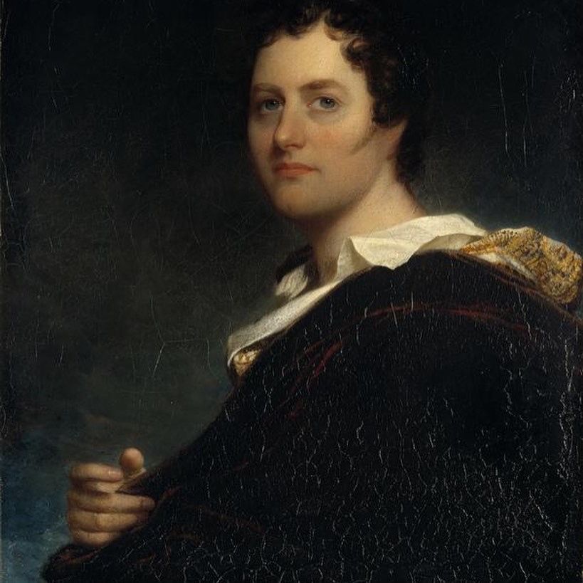
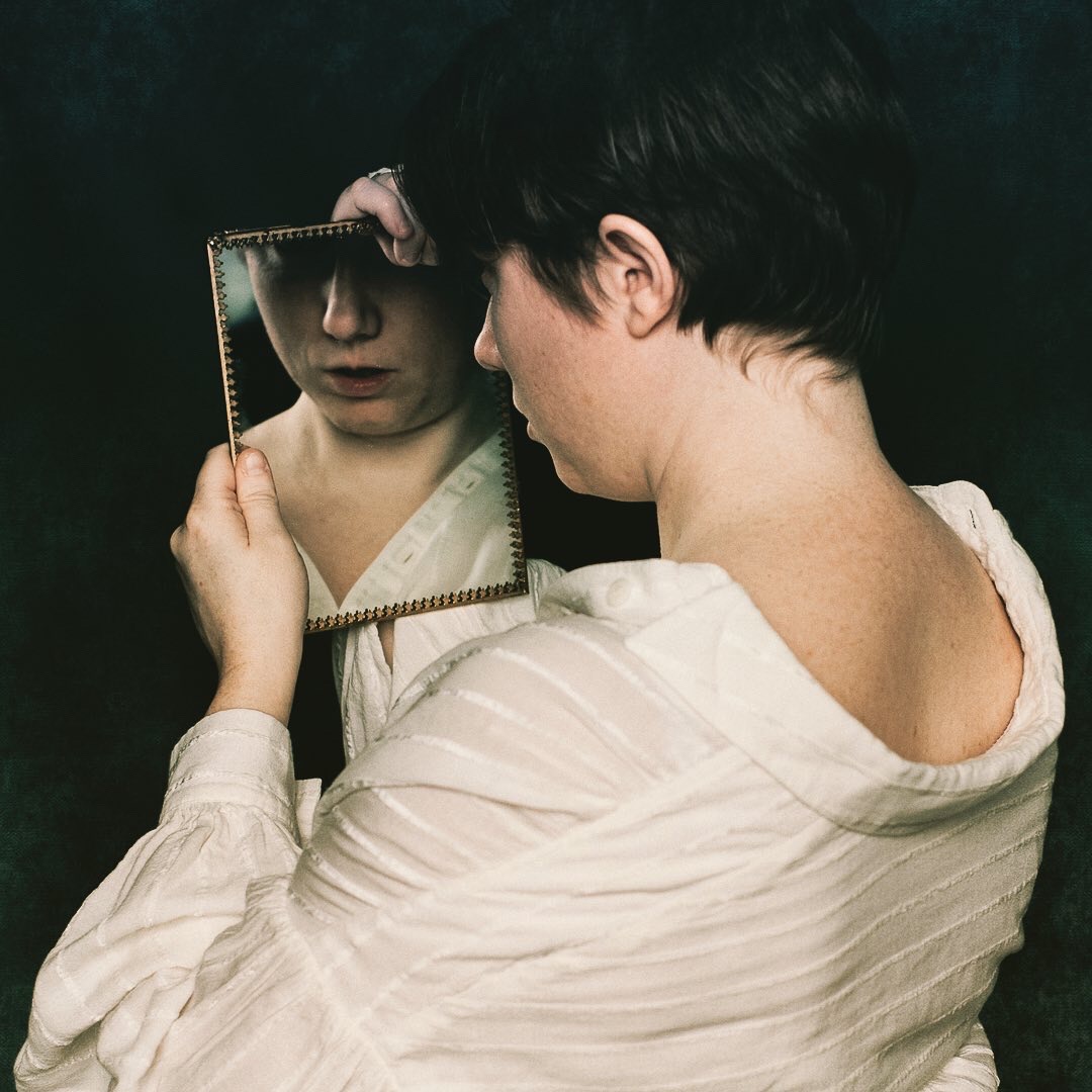
This is the portrait that inspired my image. It’s a painting of Lord Byron by Benjamin West, and it’s currently located in Scotland. At the time it was considered an awful caricature by his partner and Byron himself didn’t particularly like West as a painter (which makes you wonder why he was painted by him at all).
A few people have said that my photo doesn’t look like the West painting, that they can’t see the similarities. But my intention when using artworks this way is never to directly copy or recreate them, but rather to find some point of inspiration in the work that I can take into my photograph.
Here it was the way that the shirt was pulled back on his neck, the wavy hair, the light, and the slightly greenish tones to the image. That last point is a touch controversial – many old paintings are slightly green because of the degradation of the paint. The paints used were not chemically stable and the reds often degrade quicker than any other colour. If the artists saw their works now they’d probably be horrified at the colours they had become.
I am incredibly lucky with the room that I call my studio. I live in a Victorian townhouse (with the most incredible polychromatic brickwork) and have an east-facing first-floor bay window. It does mean that I’m limited to photographing in the mornings with natural light, but that natural light… well… it’s worth the inconvenience. I don’t know what I’ll do when I eventually have to move house, but I feel like I should start investigating how to replicate the light in the studio now so that I can keep it up!
Almost no work was done in post-processing, just colour tinting and removing a slightly ugly tassel from the top of the mirror. I added a faint bit of background texture to the edges and corners, but you can barely see it most of the time (I think it will be more prominent when I print the image).
I’m looking forward to entering this one in a few competitions. I suspect it’s the kind of image that will do quite well when placed on a wall in a nice frame with an off-white mount. But when I submitted it for critique on a Facebook group yesterday, not one single member out of the 90,000 in the group passed comment on it. As an artist surely that is the worst fate your work can receive – that it moves people so little that they neither love or hate it.
Update: This photography will be on display at The Glass Tank Gallery at Oxford Brookes University as part of an exhibition on the theme of Relationships. Come and see it in September 2020!